Project Playfair – residential redesign and interior decoration
This residential redesign was a challenging one, as the homeowner wanted us to update the front foyer to blend with the rest of the home interiors. This is an interior designer’s biggest challenge, as it pushes us to mimic a certain style or aesthetic that may not necessarily be our type or our favourite.
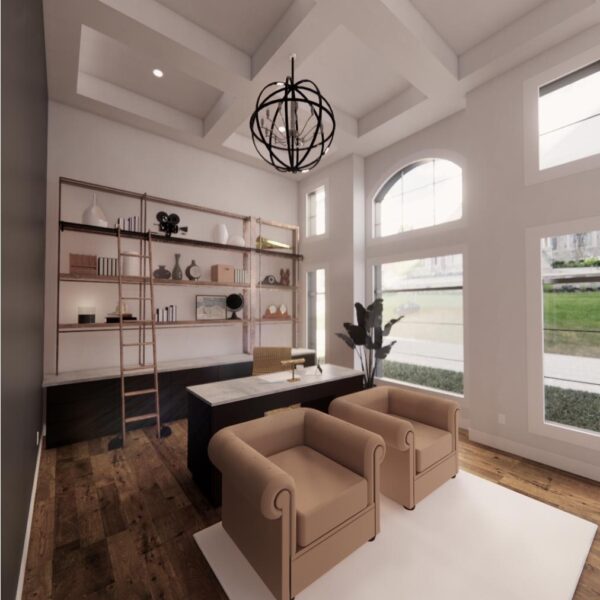
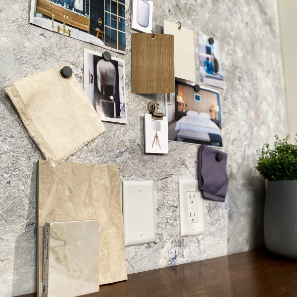
We provided the homeowner with three design concepts that were able to work within the space cohesively with the remaining interior.
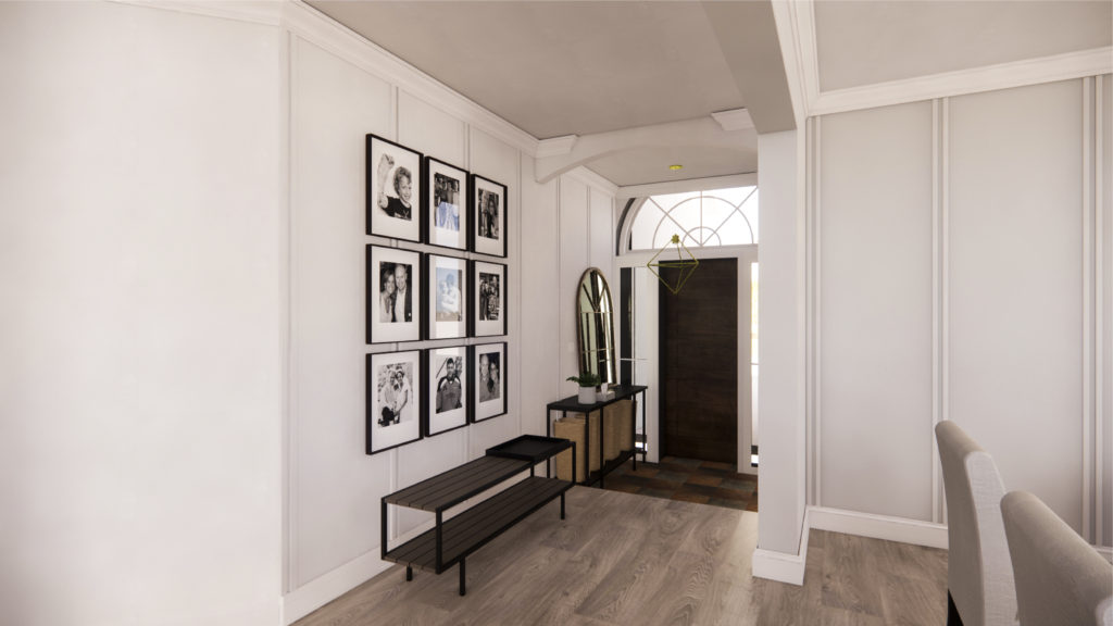
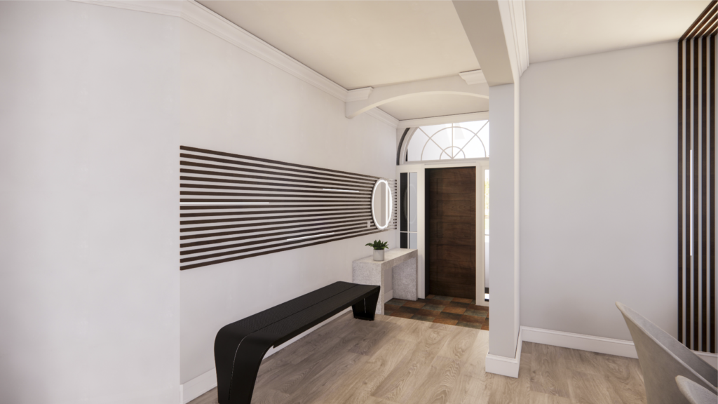
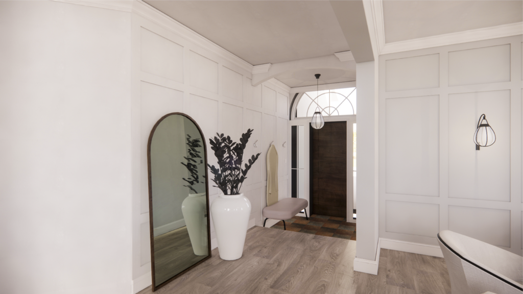
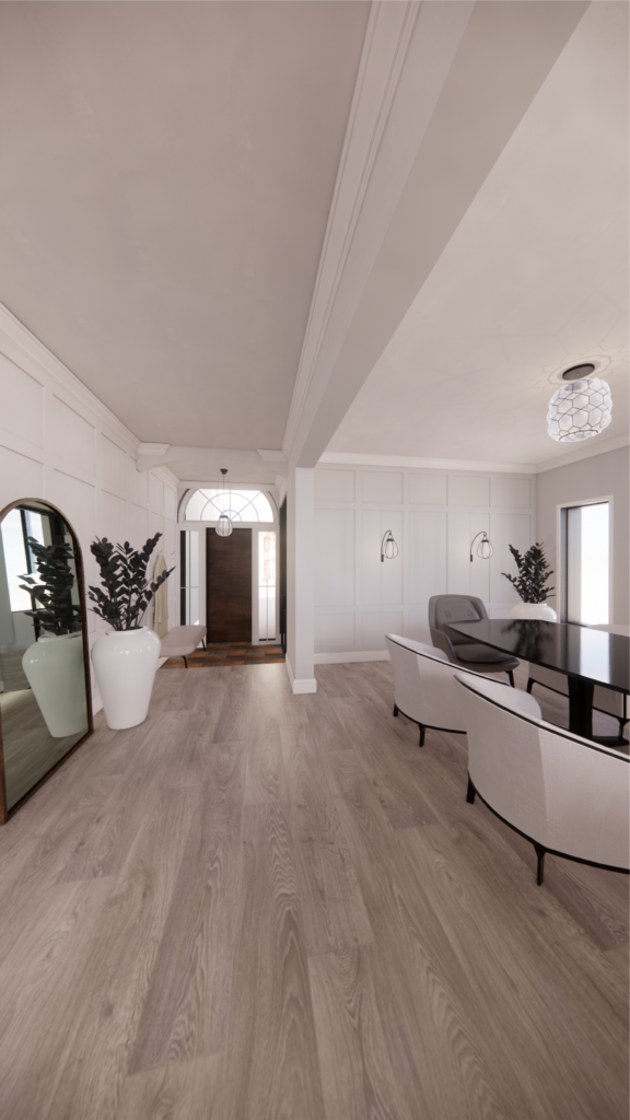
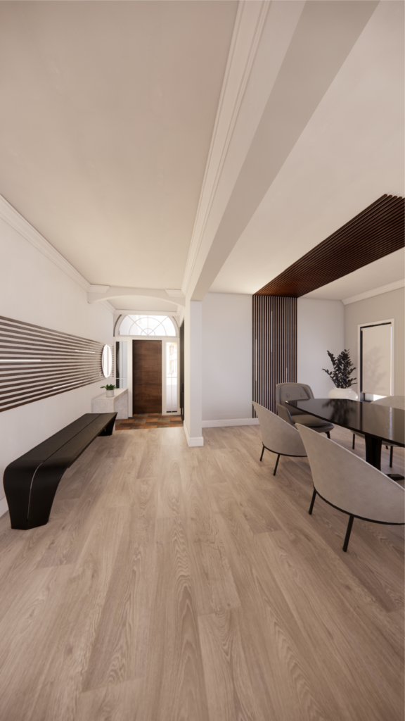
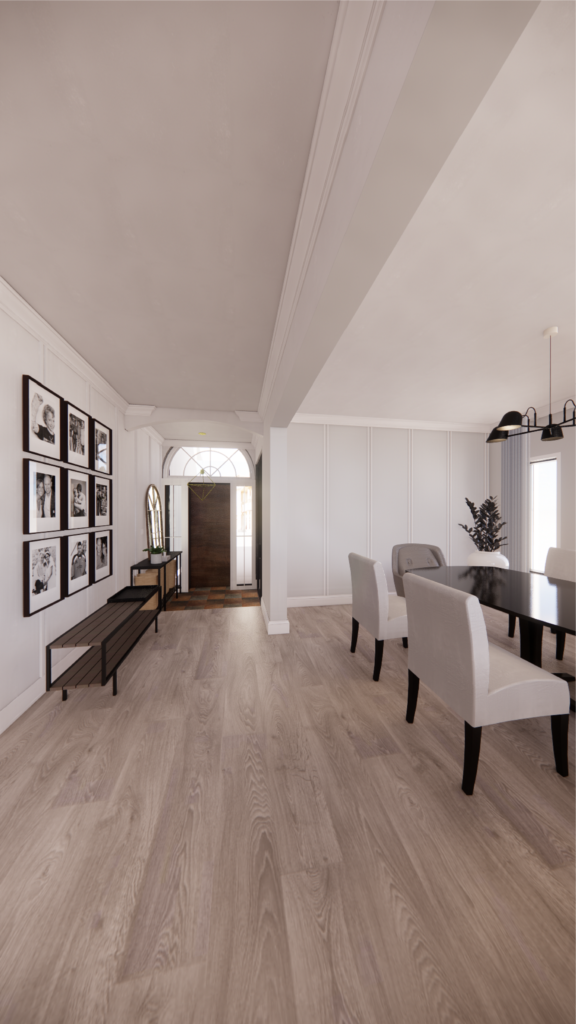
All three concepts evoked different aesthetics, but maintained the same colour scheme, as most of the home’s interior used these colours throughout. The most successful of the three concepts enabled the homeowner to feel like the space transitioned seamlessly from room to room. Using the same colour scheme provided the client with a sense of ease as the new space felt very familiar.
Key note: when showcasing a design concept to match an existing look or feel, always remember to try and use the same colours found within the existing space; the design will feel cohesive.
Create a number of visuals before you commit to one. Sometimes the best thing to do is create one visual for the space. Once you have one, try to contradict that visual. This will give you an understanding of a how each design concepts works and which design scheme is the most efficient.
The client decided upon this design scheme which worked perfectly with the surrounding interior space.
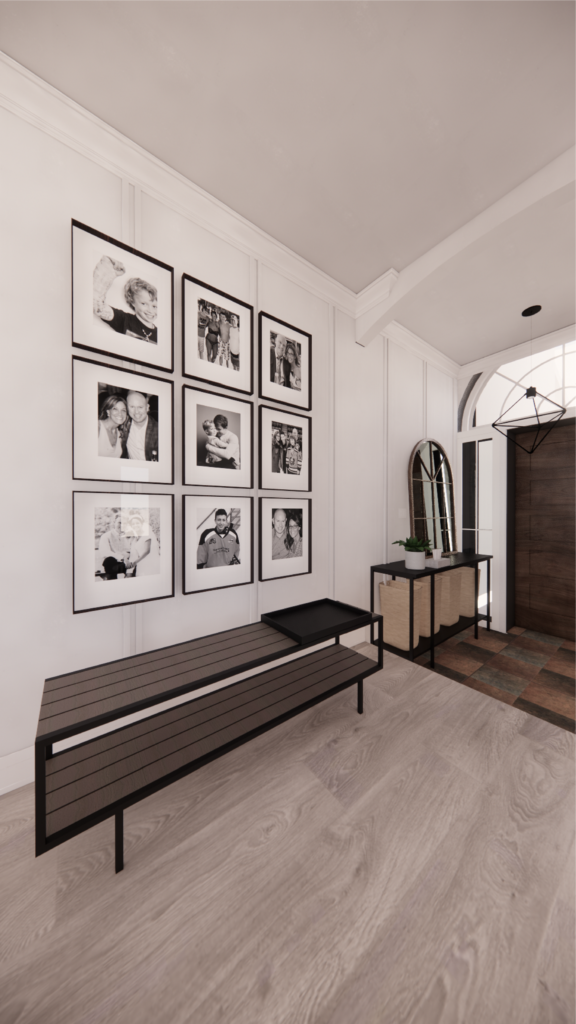
The key takeaway from this residential redesign? We provided the client with THREE concepts that each evoked a different aesthetic and feel from each other. Each design concept is different enough from each other, so it enabled the homeowner to make a quick and confident decision.
